

Building An Image Slider With Swiper Js
Creating Dynamic and Engaging Website Content with Swiper Js Image Slider


Table of contents
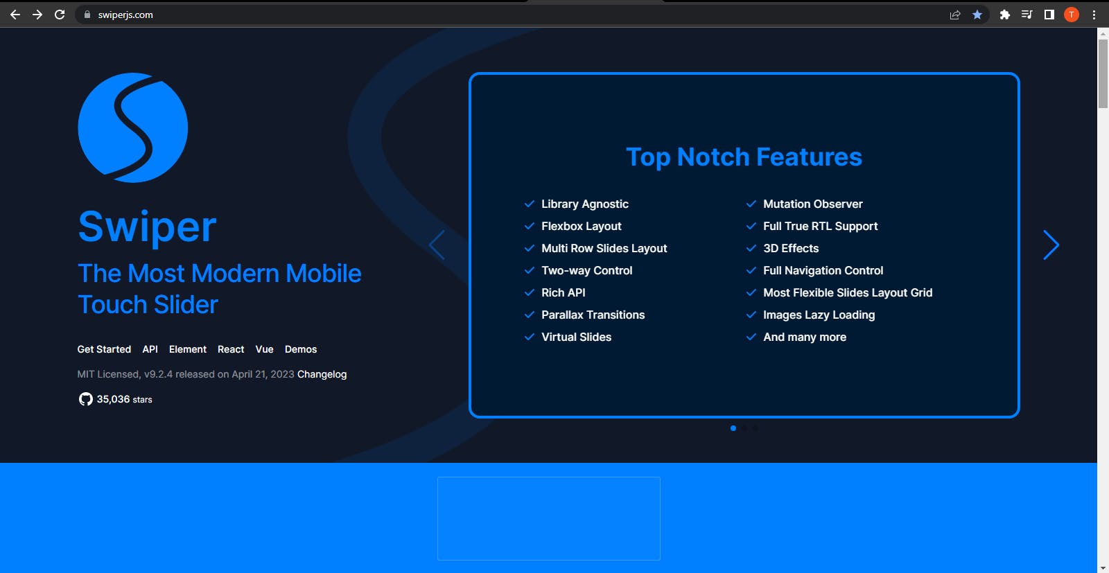
Swiper JS is a popular open-source library for creating responsive and mobile-friendly touch sliders, and carousel components for websites and web applications.
It provides a range of options for customizing the appearance and behavior of the slider, including navigation buttons, pagination, autoplay, and more. I will be going over the steps to use Swiper Js in building an image slider.
The image slider will contain a navigation for users to navigate back and forth in order to view different images. It will also contain a clickable pagination so you can click to view a particular image.
Step 1
Google https://swiperjs.com/
Click on demo
You will be provided with samples of various Swiper demos when you click on "Demos".

- Scroll down and click on navigation-per-view; above it, click on element.
The element page contains the sample code files and a live view of the project. Copy the whole HTML code and paste it on your code editor.
<!DOCTYPE html>
<html lang="en">

<head>
  <meta charset="utf-8" />
  <title>Swiper demo</title>
  <meta name="viewport" content="width=device-width, initial-scale=1, minimum-scale=1, maximum-scale=1" />

  <style>
    html,
    body {
      position: relative;
      height: 100%;
    }

    body {
      background: #eee;
      font-family: Helvetica Neue, Helvetica, Arial, sans-serif;
      font-size: 14px;
      color: #000;
      margin: 0;
      padding: 0;
    }

    swiper-container {
      width: 100%;
      height: 100%;
    }

    swiper-slide {
      text-align: center;
      font-size: 18px;
      background: #fff;
      display: flex;
      justify-content: center;
      align-items: center;
    }

    swiper-slide img {
      display: block;
      width: 100%;
      height: 100%;
      object-fit: cover;
    }
  </style>
</head>

<body>

  <swiper-container class="mySwiper" pagination="true" pagination-clickable="true" space-between="30"
    slides-per-view="3">
    <swiper-slide>Slide 1</swiper-slide>
    <swiper-slide>Slide 2</swiper-slide>
    <swiper-slide>Slide 3</swiper-slide>
    <swiper-slide>Slide 4</swiper-slide>
    <swiper-slide>Slide 5</swiper-slide>
    <swiper-slide>Slide 6</swiper-slide>
    <swiper-slide>Slide 7</swiper-slide>
    <swiper-slide>Slide 8</swiper-slide>
    <swiper-slide>Slide 9</swiper-slide>
  </swiper-container>

  <script src="https://cdn.jsdelivr.net/npm/swiper@9/swiper-element-bundle.min.js"></script>

</body>

</html>
If you already have an HTML boilerplate, then you will need the Swiper link, HTML, and CSS code:
Scroll down the element page
Copy the link on the script tag and paste it into your HTML boilerplate below all HTML tags.
<script src="https://cdn.jsdelivr.net/npm/swiper@9/swiper-element-bundle.min.js"></script>
The Swiper link is necessary to make any logic you add functional. Without the link tag, the slider wouldn't work.
- The next step is to copy the HTML code and paste on my code editor
<swiper-container class="mySwiper" pagination="true" pagination-clickable="true" space-between="30"
    slides-per-view="3">
    <swiper-slide>Slide 1</swiper-slide>
    <swiper-slide>Slide 2</swiper-slide>
    <swiper-slide>Slide 3</swiper-slide>
    <swiper-slide>Slide 4</swiper-slide>
    <swiper-slide>Slide 5</swiper-slide>
    <swiper-slide>Slide 6</swiper-slide>
    <swiper-slide>Slide 7</swiper-slide>
    <swiper-slide>Slide 8</swiper-slide>
    <swiper-slide>Slide 9</swiper-slide>
  </swiper-container>
- Then I will be replacing the slide 1 text with an image tag containing some images for each
swiper-slide
<div class="slide-container">
        <swiper-container class="mySwiper" pagination="true" navigation="true" loop="true" pagination-clickable="true" space-between="30"
            slides-per-view="3">
            <swiper-slide>
            <img src="https://thegadgetflow.com/wp-content/uploads/2020/04/10-gadgets-for-a-futuristic-home-office-1200x675.jpg">
            </swiper-slide>

            <swiper-slide>
            <img src="https://resources.owllabs.com/hubfs/uneebo-office-design-yNtCxu4kJXk-unsplash.jpg">
            </swiper-slide>

            <swiper-slide>
            <img src="https://cdn.bisnow.net/resize?type=jpeg&url=https%3A%2F%2Fs3.amazonaws.com%2Fcdn.bisnow.net%2Fcontent%2Fimages%2F2019%2F03%2F5ca121a2f2118-20180520_venture_arch_opentable_0002_screenres-copy.jpeg&width=2160&sign=0OQSfq1SFkLDAMZhNvFNGDfDgR7LLrpgTkBcab8_tqc">
            </swiper-slide>

            <swiper-slide>
            <img src="https://www.hpe.com/content/dam/hpe/insights/articles/2021/09/how-technology-is-enabling-the-new-hybrid-workspace/How-technology-is-enabling-the-new-hyrbid-workspace.jpg.transform/nxt-original/image.jpeg">
            </swiper-slide>

            <swiper-slide>
            <img src="https://cdna.artstation.com/p/assets/images/images/049/563/806/large/amy-colored.jpg?1652793049">
            </swiper-slide>

            <swiper-slide>
            <img src="https://cdn.oneesports.gg/cdn-data/2022/02/Anime_HimoutoUmaruChanR-1024x576.webp">
            </swiper-slide>

            <swiper-slide>
            <img src="https://i.pinimg.com/550x/f5/a3/85/f5a385e2976b8d378a55cfa04396315a.jpg">
            </swiper-slide>

            <swiper-slide><img src="https://www.cnet.com/a/img/resize/69256d2623afcbaa911f08edc45fb2d3f6a8e172/hub/2023/02/03/afedd3ee-671d-4189-bf39-4f312248fb27/gettyimages-1042132904.jpg?auto=webp&fit=crop&height=675&width=1200"></swiper-slide>

            <swiper-slide><img src="https://imageio.forbes.com/specials-images/imageserve/5f962df3991e5636a2f68758/0x0.jpg?format=jpg&crop=812,457,x89,y103,safe&width=1200"></swiper-slide>
        </swiper-container>

    </div>
The JavaScript Logic
Inside the swiper-container, the JavaScript code for the slider is included and you can add or remove any of them.
<swiper-container class="mySwiper" pagination="true" navigation="true" loop="true" pagination-clickable="true" space-between="30"
            slides-per-view="3"></swiper-container>
navigation="true"- provided for two arrows with a default color of blue to go to the next image or the previous image.pagination="true"andpagination-clickable="true"provides for pagination below the images with a default color of blue. Since I setpagination-clickable="true",It allows users to click on the pagination to view a particular image. If not set, it won't be clickable.slides-per-view="3"ensures only three images can be viewed on screen. To view more, you would need to use the navigation icon. So if I make it 4, It will set the images on view to be 4.
CSS Styling
- The styling of a slider is important because it determines the look. This is why I will be giving a short explanation of the styling I used.
.slide-container{
      display: flex;
      justify-content: center;
      align-items: center;
      height: 100vh;
    }

    body {
      background: #1F1F1F;
    }

    swiper-container {
      width: 80%;
      height: 60%;
    }

    swiper-slide img {
      display: block;
      width: 100%;
      height: 100%;
      object-fit: cover;
    }
The Styling
I gave the HTML body a dark grey background color of
background: #1F1F1F;The container holding the Swiper container slide-container is displayed
flexallowing for flexible sizing and positioning of elements within a container. so it can be aligned to the center of the webpage usingjustify-content: center; align-items-center;.The "height" property is set to "100vh", which means the height of the container will be equal to the height of the viewport, ensuring that the image slider takes up the entire screen.
.slide-container{
      display: flex;
      justify-content: center;
      align-items: center;
      height: 100vh;
    }
- The Swiper container
swiper-containersets the width and height of the image slider to 80% and 60%, respectively. This means that the slider will take up 80% of the width of its container and 60% of the height, leaving some space around the edges for other content. This is a good practice to ensure that the slider is not too large or too small on the page.
swiper-container {
      width: 80%;
      height: 60%;
    }
- The last section,
swiper-slide img, styles the individual images within the slider. Thedisplayproperty is set toblockto ensure that each image takes up its own space within the slider. Thewidthandheightproperties are set to100%to ensure that each image takes up the full width and height of its container. Theobject-fitset tocover, which means that each image will be scaled to cover the entire container while maintaining its aspect ratio.
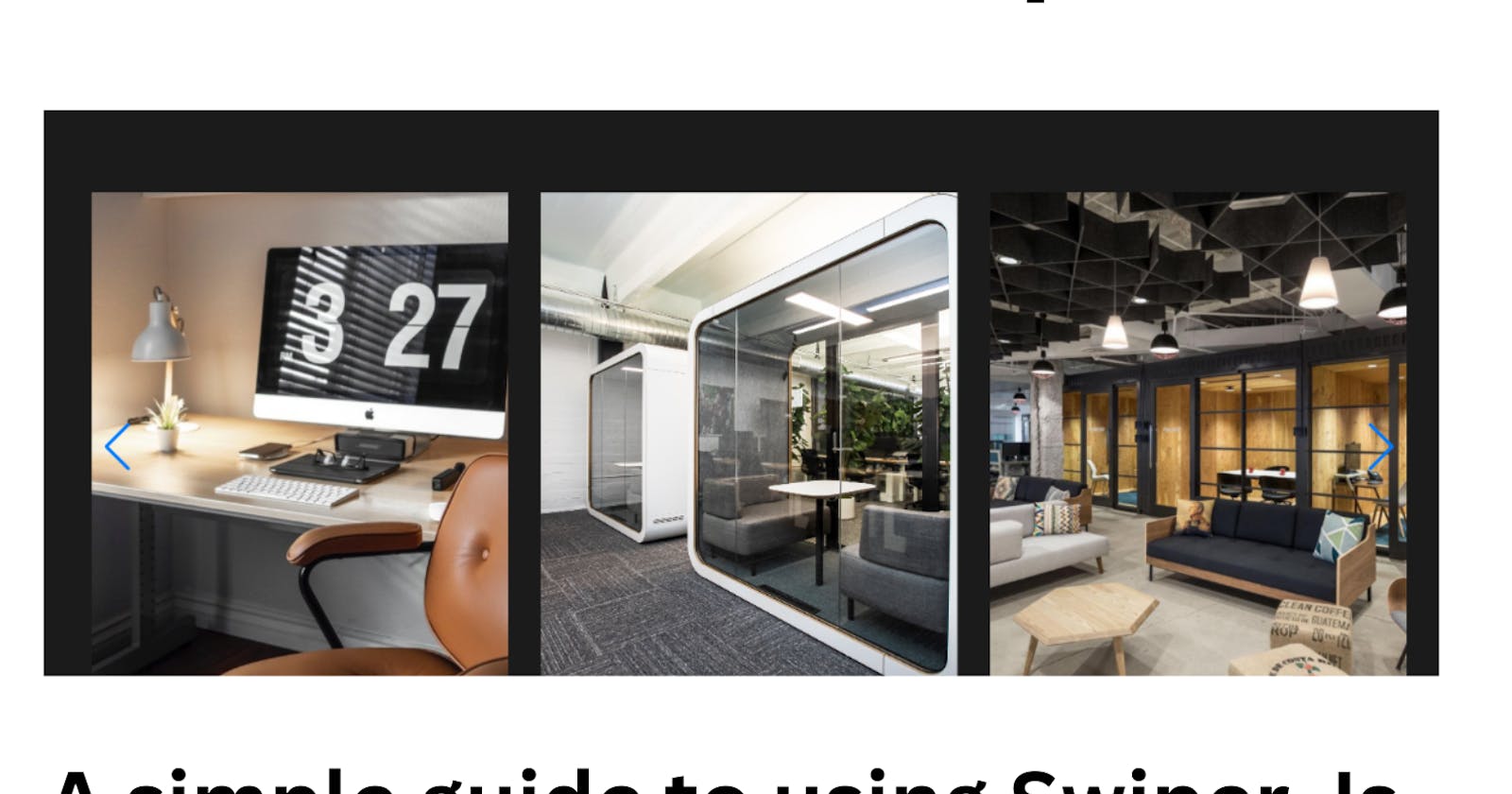
The final Result
NOTE: You can change the color of the navigation and pagination depending on your preference.
If you found this article helpful, do like and follow for more helpful tips on web development. If there's anything you need an explanation on, be sure to reach out. I will always be active to provide an explanation.